Does anyone else miss the futuristic early 2000’s tech UI aesthetic?
Context:
Interfaces like in the original 2001 Xbox, the Motorola Droid, Fallout Pip Boy, Spy Kids, Oddworld: Abe’s Oddysee, and retro futuristic WinAmp skins, whatever this aesthetic is called, have a certain charm, nostalgia, and appeal for me.
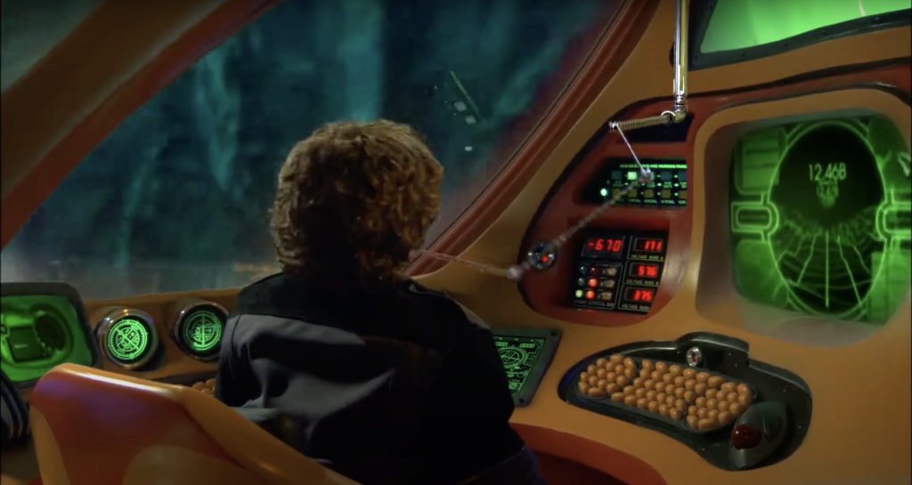
I remember seeing the original Xbox startup screen as a kid and thinking how cool, alien, and futuristic it looked.
Now, as a professional software engineer familiar with the full product development lifecycle, I have a lot of appreciation for the designers and engineers behind this work. Kudos to the Xbox team at that time, because it seems like an extremely deliberate, thoughtful, and opinionated design that, although may now be antiquated or out of place, really captured a certain feeling and fully committed to that, through and through. This led to a very cohesive experience with a consistent feel throughout the whole operating system, including sounds, particle effects, coloring, movement animation, and 3D models.
Although I am a big fan of the modern minimalistic movement that began with iOS 7 for its clarity and ability to cut through excess and distractions, I feel like the rise of this design style came with a major downside. Without a strong design language or careful consideration for what’s being removed, minimalism can lead to a loss of personality, making products feel bland and soulless since everything conforms to the same plain cookie-cutter type of look, rather than leaning into the personality behind their product and user’s niche market.
I made a little blog post since I found it to be an interesting problem and worth explaining, at the very least for posterity for myself, in case anyone else also finds it interesting.
First things first:
I’ve been an iOS Engineer for over 1o years now, and have always been a big fan of Apple’s design and general approach to UI/UX so naturally, since that’s my frame of reference and expertise, I thought it would be interesting to take a stab at trying to recreate this sort of UI but adapted for iOS.
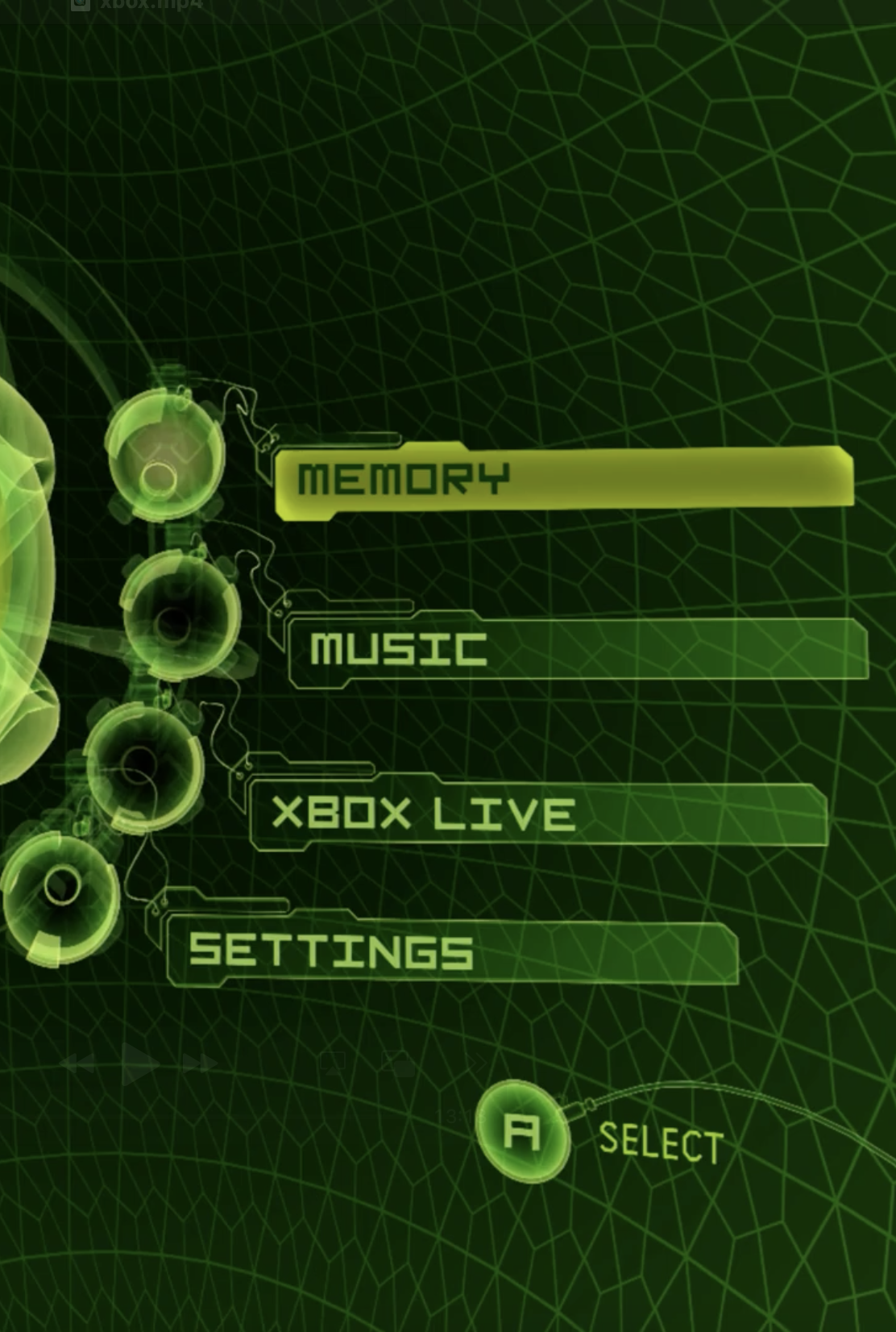
I started by analyzing a screen recording of the main menu and going frame by frame to fully grasp the minor details going on, especially with the animation. You’ll notice that in the background there are curved grid lines moving very slowly from right to left.
In my mind, it kind of looks like you’re inside of a sphere or the center of a globe with latitude/longitudinal type lines while it slowly rotates, so naturally, that was the approach I took to drawing this.
The rotating half-sphere is just a grid of curved lines mapped onto a sphere, then projected into 2D using some perspective math. Each point is positioned using spherical coordinates, rotated around the Y-axis, and scaled based on depth to create the illusion of curvature. A timer gradually shifts the rotation, making it look like the sphere is slowly turning in space. Not actually 3D, just math and SwiftUI paths doing all the work.
I was on the right track except I wanted the half sphere to remain “fixed” in front of me while the lines continued to move, kind of like a mask, so I had to continue to tweaking the perspective math to keep the sphere stationary while making the grid lines animate. Simply rotating the entire sphere made it feel like an object floating in space.
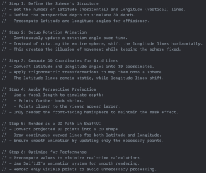
Instead of rotating the entire sphere, the longitude lines shift left while the latitude lines stay fixed, maintaining the curved 3D look. The projection math ensures that points shrink as they move further back, mimicking real-world perspective. By applying a perspective transformation, only the front-facing part of the sphere is visible, reinforcing the illusion of depth while keeping the animation smooth and seamless. This effect creates the illusion of a fixed half-sphere while the grid lines continuously move, simulating depth and motion.
It was more complicated than I expected and required a fair amount of math but after a few iterations, I got something I was happy with.
Menu item layout:
After having the background styled and animated, the next part that stood out was the circles beside the menu items.
It was difficult to establish a definitive layout guideline but to me and my brain, it sort of looked like a rotary phone dial. So naturally, I went ahead and created that.
I started with a circle that was then populated with 12 numbers, like an analog clock. This was fairly straightforward. I added a basic animation on selection to move the green dots, similar to the Xbox UI, but found that matching an analog clock with the 12 numbers was not quite right, the items in the Xbox’s “circle” rotary phone dial were more densely arranged so I tweaked the UI a bit to move the dials onto the ring and make the number count 14 instead to reflect the referenced original Xbox UI more closely.
In the Xbox screen, the menu items (the numbers on the analog clock in my case) aren’t perfectly spaced out. They’re sort of offset at an awkward angle and don’t have the same spacing as a standard analog clock. I chose to put 14 “hours” on my analog clock and picked the position of 2-5 since that looked closest to the Xbox screen.
The positioning was very similar and I was satisfied with that, but now we had to look at the animation. The Xbox menu items slide and offset the prior menu item to the new selected menu item, again, similar to a rotary phone, however, on a mobile phone, the positioning gets uncomfortable.
Also, I still didn’t have a good idea or method that I was happy with for picking the positioning of the menu items (besides the 2-5 position). A normal clock has equal distribution between all of the numbers but the Xbox menu has an offset that looks somewhat pinned to the bottom of the circle but that doesn’t work so well for items at the very top and bottom in the horizontal center for example, but there’s no UI menu with all of the rotary “dials” active so it’s hard to make an assumption of what the layout would look like there anyway.
Due to the nature of screen ratios (widescreen 16:9 TV vs a vertical iPhone display), the layout also doesn’t make sense on an iPhone so we have to clip the rotary phone dial to only be the far right side to be able to have room for the menu items as well.
So I settled on fading the menu items above the current selected menu item and allowing a swipe gesture for retrieving “missing” items that were faded out.
Is it a good UX pattern to fade out elements and not have a clear indicator you can swipe to get them back? Probably not. However, as this is a project just for me and I don’t have any requirements to fulfill, it’s not a problem.
With this in place, the only thing left is to design the menu items.
Menu items:
This was the most straightforward part I think. It’s a basic rectangular shape with some curves reminiscent of a Manila folder tab so I just added some extra paths to a custom shape. And of course, the super classic Xbox font.
After the shape was good, I added a stroke border, a blur, a glow effect, a rotation offset effect and minor styling as well as the custom font, a minor “flickering” effect similar to the Fallout Pip Boy, a little noise on the movement so it doesn’t feel perfectly smooth, and voila, we have our menu items!
“Plasma” view in background center:
In the main menu screen, there’s also a sort of “black hole” faded radial gradient in the center. Although I did the opposite and added a brighter radial gradient that fades out in the center to make it more visible but this contributes to a nicer “popping” effect that really helps the UI stand out against the background.
Putting it all together:
Final thoughts:
One part I struggled with was the sort of “chaos” in the layout, I think the coordinates of how the menu circles are arranged aren’t necessarily a perfect circle and maybe just adjusts across a spectrum or maybe is even hardcoded at manually selected points but for me, it’s so hard to avoid pixel perfect layout with nice references like a circle or grid lines etc to align to.
I also noticed the background has hexagons on top of the lat/long lines, centered at their intersection and that was beyond my mathematical abilities. I actually researched a bit and found it’s not possible to cover a sphere with hexagons, and it’s a soccer ball pattern, called a truncated icosahedron.
Additionally, the “dials” on the rotary phone view could be styled to be more “glowing” and transparent etc, to match the source but the key majority of the UI I wanted to replicate had been achieved by this point.
Besides that, there are little wires and minor more complicated textures/little fringe details on the Xbox menu screen that really drive the aesthetic home but it felt out of scope for what I was trying to accomplish and by this point, my “itch” had been scratched and I was pretty happy with how it turned out.
It was a fun adventure to get to this point and by now, I was satisfied to call it a day!
Let me know if you have any questions or suggestions for improvement!
Thanks for reading 🙂